


Typographic Torus
Client: Sef-Authored
Collaborators: JKDS
Status: Complete
Year: 2018
Tag: Media
Client: Sef-Authored
Collaborators: JKDS
Status: Complete
Year: 2018
Tag: Media
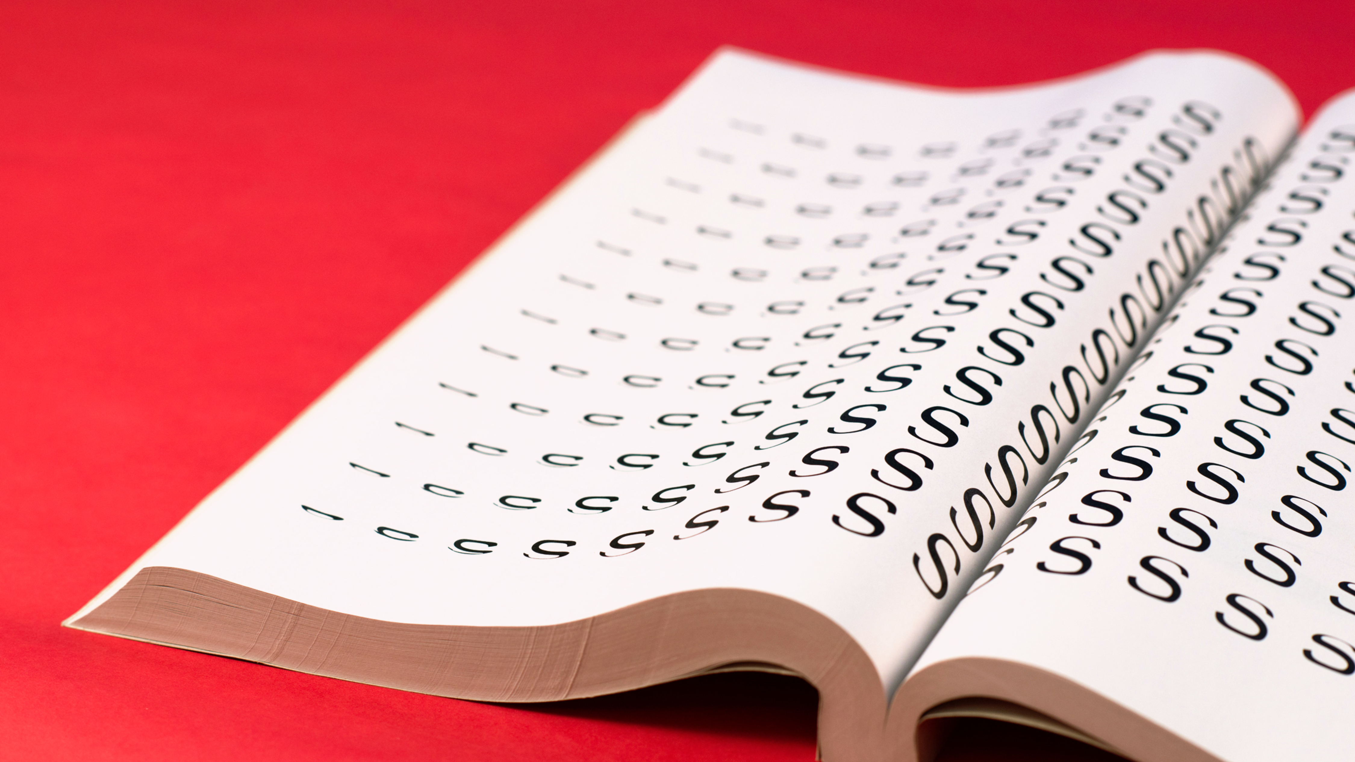
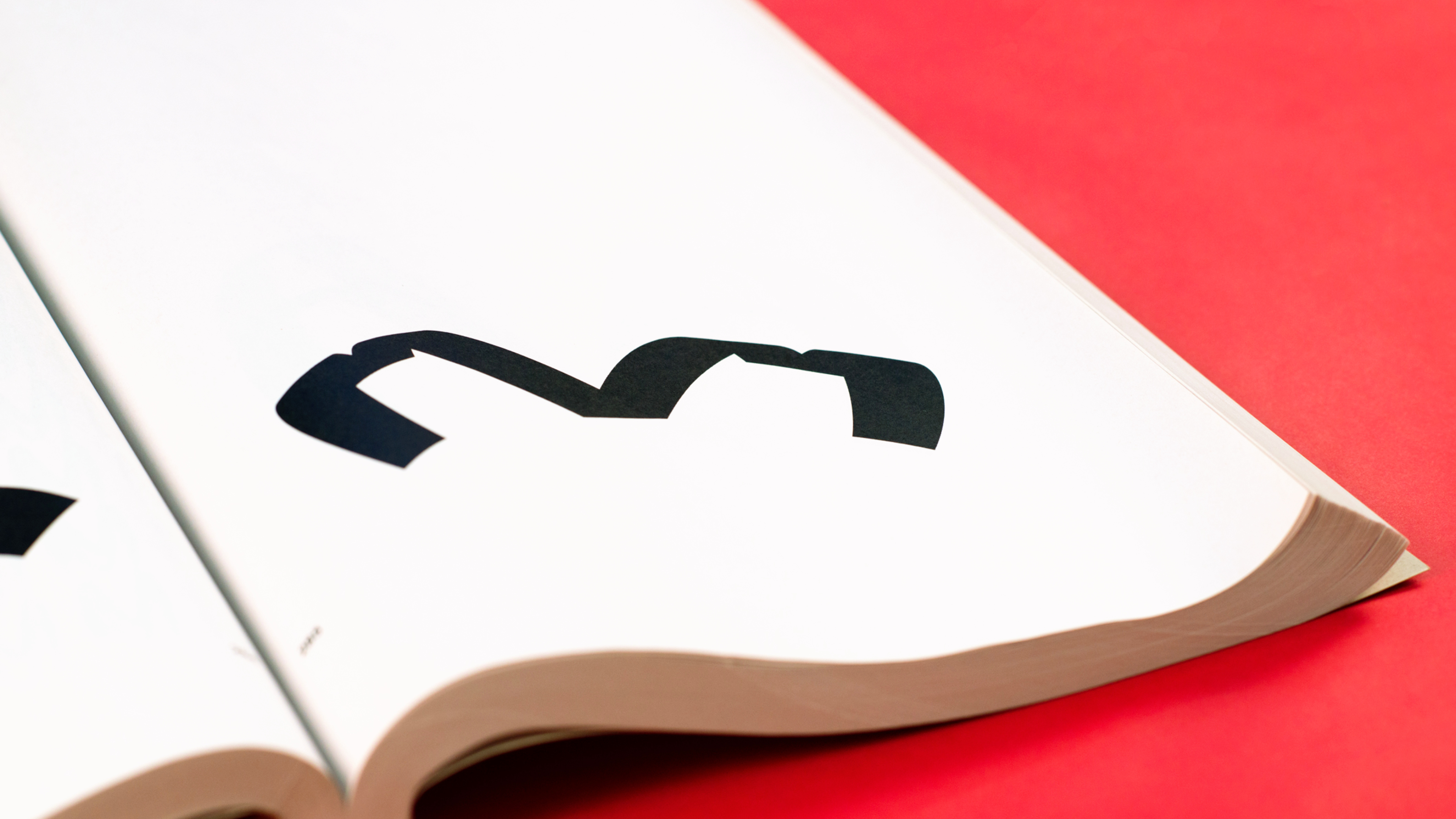
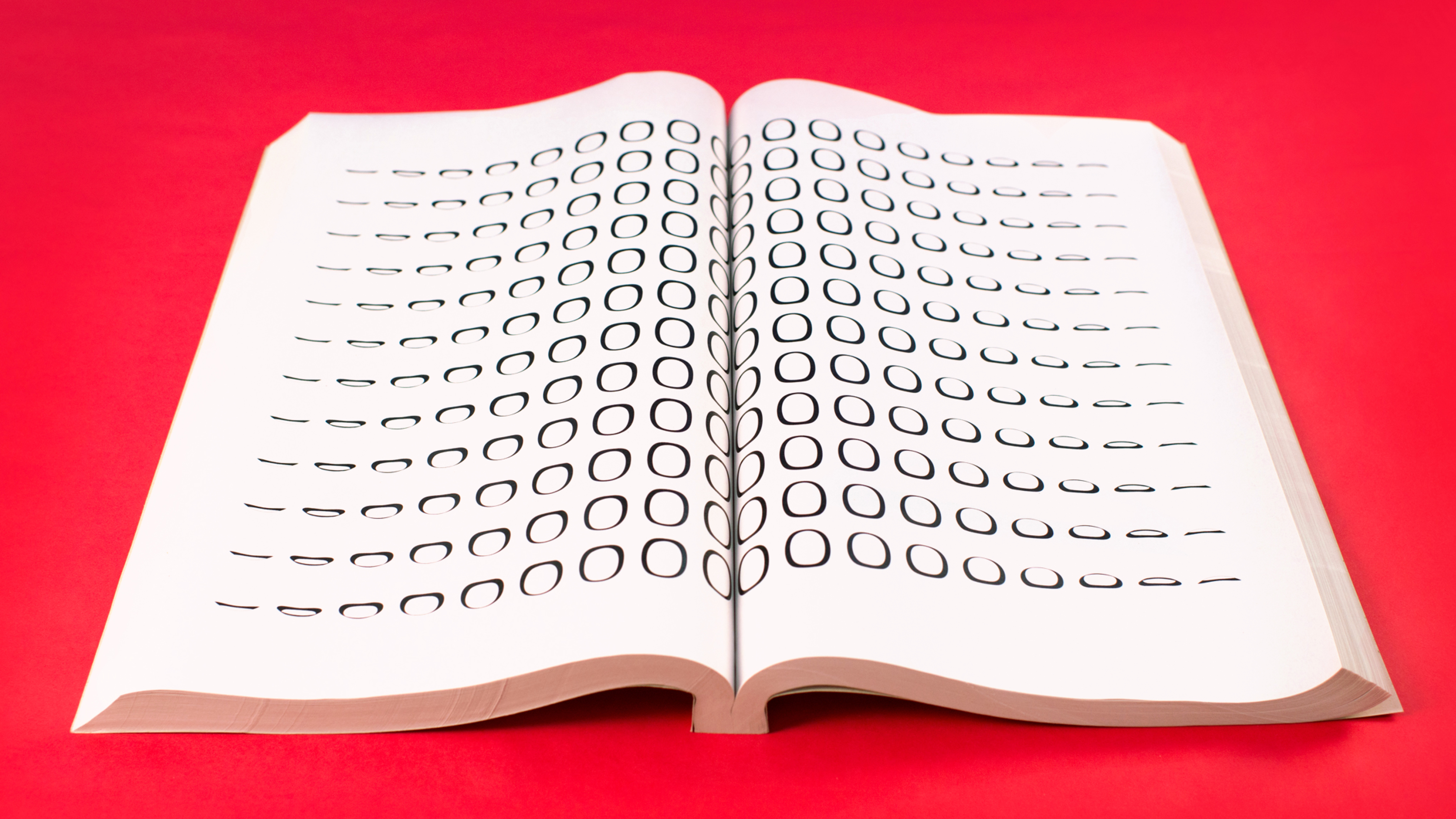
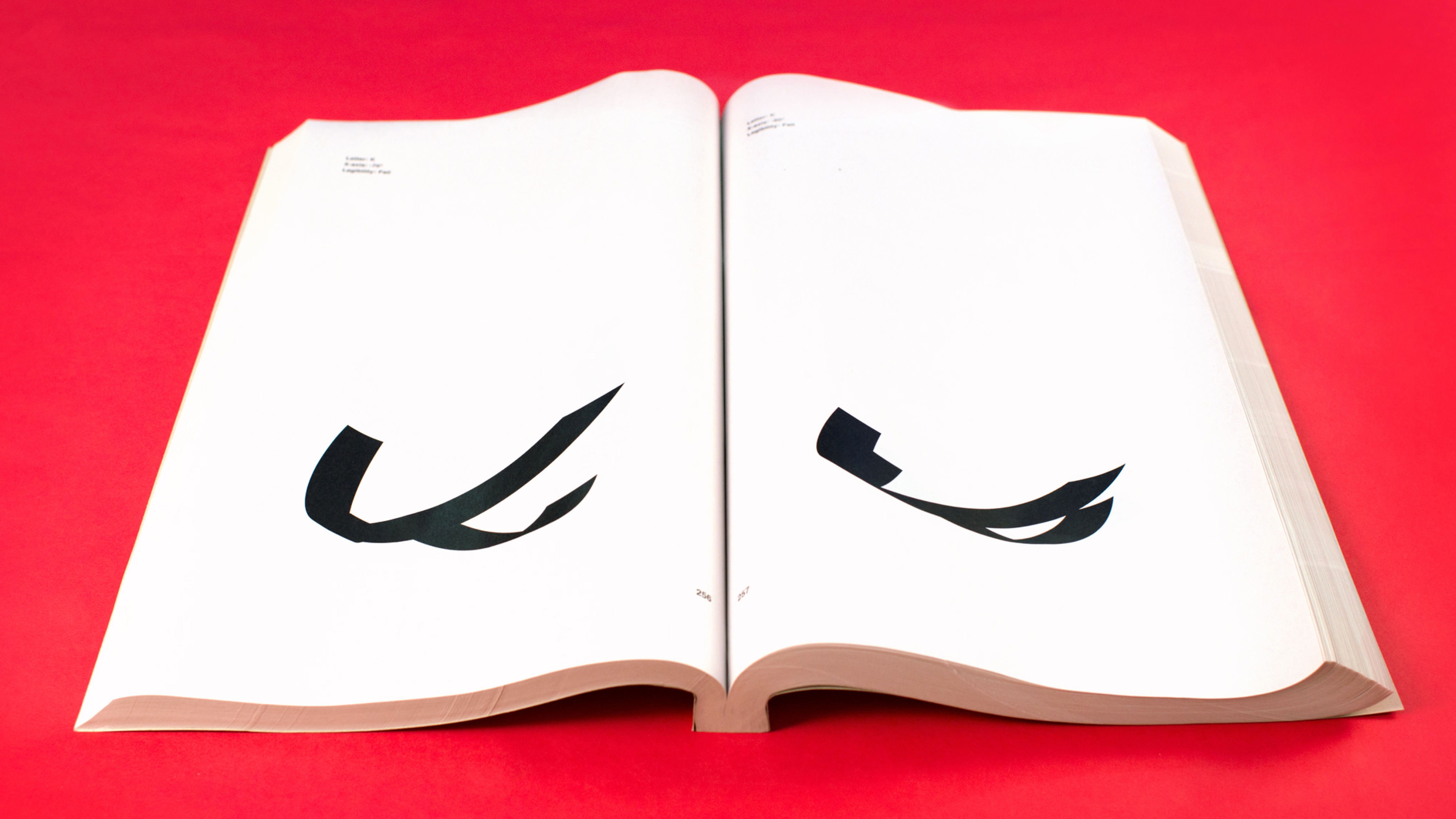
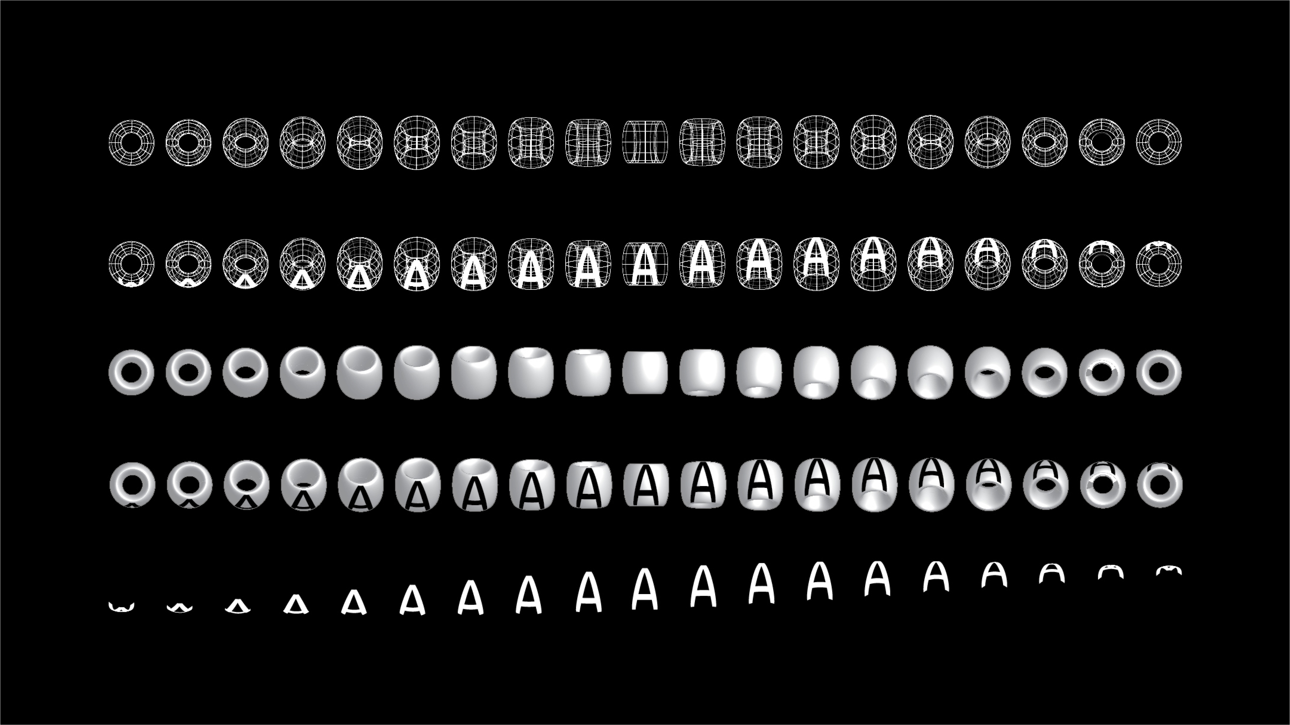
Typographic Torus is a ongoing typography project based on testing the legibility limitations of the Swiss typeface Helvetica when applied to a torus. The torus, the physical shape that represents an infinite loop, allows for a testing of the typeface’s extremities by altering its dimensional angles. This test allows us to observe how far we can push the typeface until it completely diminishes in legibility.
The experiment was conducted with a torus made of an 180pt condensed circle and shows the effects on the letterforms that the torus created when rotational changes are made only to the x-axis. The y and z axes were left untouched at 0°. A condensed circle was chosen as the base shape rather than the more traditional perfect circle because it allowed for more than 50% of each tested character to be rendered legible. The torus was then rotated on the x-axis at different degrees.
These x-axis rotations were all analyzed at 10° intervals between positive 90° and negative 90°. After each rendering, the tested letterform was removed from the torus. Each letter variation was given a pass or fail rating based on its ability to be recognized as a typographic mark. The pass/fail test for legibility was conducted with each letterform placed on a card, shuffled then randomly selected by the participant. If the character received an 70% match to its character of origin then it was given a pass. If not then it received a fail grade.